My husband recently commented that I have not been diligent about sharing very many of design projects on my blog and he's right. I try to share some updates on Instagram and Facebook because they are quick and it does take more time to write a blog post but he's right, its important to show what I've been working on - both big and small. I'm kind of a perfectionist and so always feel like I need to show very finished projects with perfect pictures but that's not always possible or practical or frankly real life. And I think it's important to remember that change doesn't have to come in massive overhauls. Not everyone has the time, energy or budget for that. I love helping people fall back in love with their homes and that can range from furniture rearrangement to shelf styling to new accessories that don't have to cost a fortune. The other thing that is hard is that design on a budget takes time. Finding the right pieces for a space takes time. Ponying up for big ticket items is hard when you have multiple things you need to purchase in a space. I work at my client's pace and many spaces are ongoing and evolving and are not instant before and afters. But I will try to get better about it because I do think it is important to see a range of styles and budgets and inspiration.
Recently I've helped with several papering projects that have all changed drastically thanks to a little wallpaper action. What may surprise some of you (it often surprises my clients) is that wallpapering a space can actually be a very affordable way of making a major impact. I'll caveat that by saying, like anything, there are varying degrees of expense. Sure, you can pick SERIOUSLY high-end paper but there are plenty of affordably priced, beautiful papers available. Here I am sharing with you some examples of affordable papers that look great!
First up is this eat-in dining area in a client's home. We selected a grasscloth to warm up the space with some great texture. This particular paper has a dark navy background underneath the grasscloth that is quite striking. Here is the space before:

Here's a close up look at the grasscloth we used:

And here's the after!

We still need to find some good art for the space but do you see immediately how much warmer the space feels?
Next up is a powder room update. The space is small and so it is really hard to photograph but the change is awesome. My clients really wanted to make a WOW statement in the space and I think they have achieved it. Here's the space before (ignore the papers taped up - we were testing out some options):


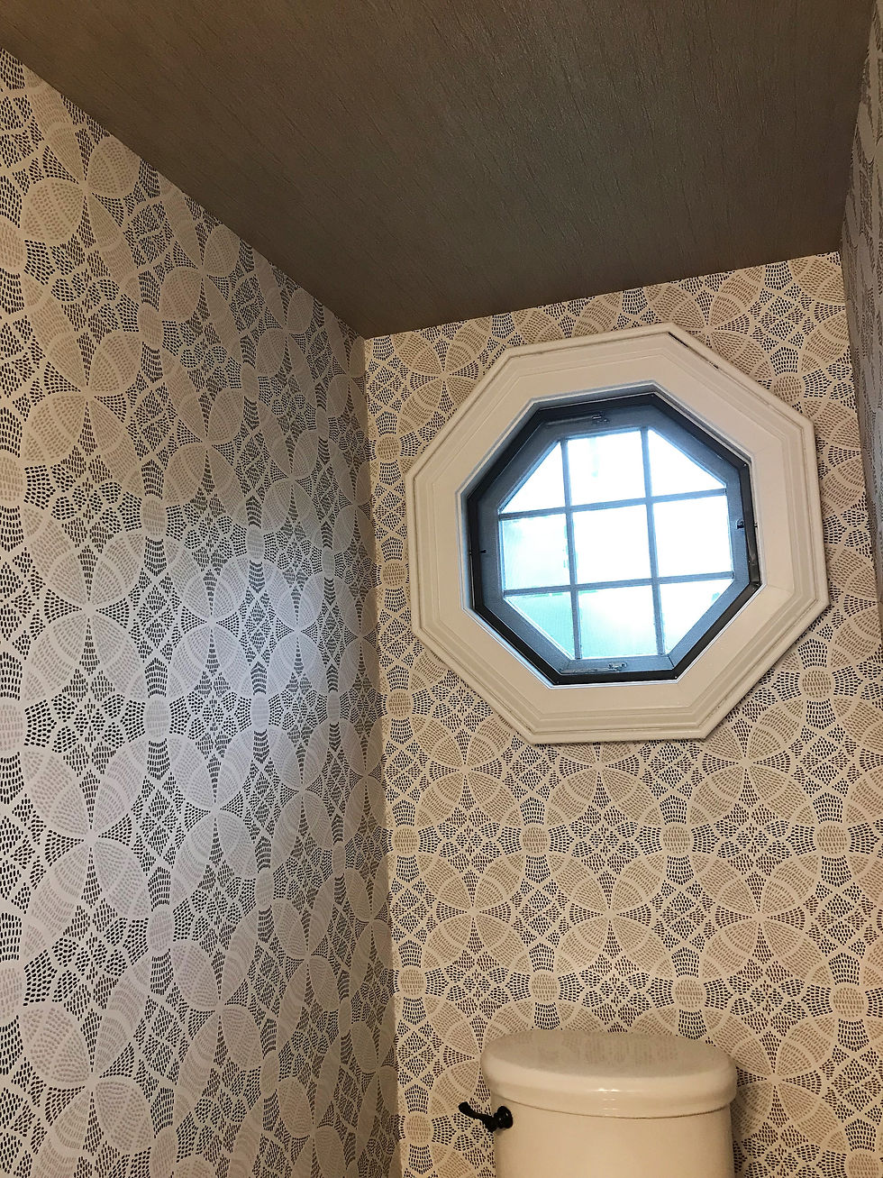
My clients narrowed down the options to several papers they liked and then I came in to help them finalize the decision. Ultimately we decided on this paper for the walls - amazing pattern and texture:

The ceilings are really high but have lots of angles so to help that feel more uniform, we papered the ceiling as well. We used this awesome textured metallic paper:

Here's the newly papered powder room. It feels so much bigger and now has such great style!


This next powder room is still a work in progress but has changed so dramatically that I wanted to share. My clients have a small powder room downstairs that was previously covered with what they not-so-fondly referred to as "the circus stripe wallpaper." It's pretty obvious to see why :)

The wood vanity, brass fixtures and mirror felt a little dated and my client wanted to make changes without a major renovation or replacement or hit to the budget.

First, we selected this Serena and Lily Paper. It's their arrow paper and the color is fog for anyone interested.

Once we decided on the paper, we were able to select a paint color for the vanity. A fresh coat of paint updated it immediately.

And the paper feels so fresh and clean. The whole space feels bigger and so much brighter!

We replaced the sconces and still need to decide on a mirror and hardware but it is coming together so nicely!

Sometimes you don't have to paper a whole room for big impact. Here are two projects where we just papered the back of the shelves and it makes such a difference!
The first is a playroom. My client wanted me to style the shelves in this safari themed space and so I first suggested giving the shelves a little more oomph. Here's the before:

And here's the shelves after the paper went in:


And here are the shelves after I styled them (my most favorite thing to do!!):


And here are some shelves in a client's living room where we added grasscloth to the back to warm it up:


Consider yourself warned: wallpapering can become addictive. Begin at your own risk.
And since this is almost sure to be my last post of 2018 - wishing all of you a happy and healthy New Year! Thanks for following along on my blog!
xo, Cameron


